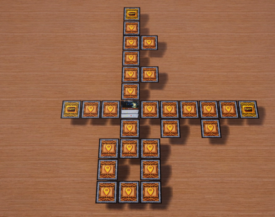
First to clarify how it worked before, you would draw generation cards that have 3×3 size grid with card locations. 5 cards are always placed in the + symbol at the start of the generation then you would join grids from your generated cards to other grids with the lowest number going from the furthest tracking back. always looking at the previous generation cards for the next lowest number on the furthest generation card. slowly removing each possible connection until you run out of generation cards. This generation style has led to some wild patterns, but mostly it favored long lines. also it was way too complex (even to the extent, i had a hard time coding it to the computer version).
After thinking about different options, I have decided on two major changes to the generation system.
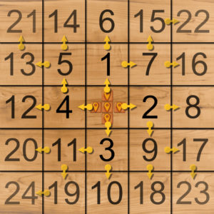
- New way to generate – you have a single set template by which to lay generation cards with, this means you just place generation card grids from 1 going up rotating each generation card to align with the arrows. making the first four really simple and then you have to look if there are circles on the previous card but there can be only one possibility of connection making, this step from the previous system much less time consuming and it doesn’t involve any connection priorities. then there is the fact the preset pattern is square-diamond shape, cumming from middle going out, this makes the generated shape more square. From a game-play perspective this will make the games shorter(which is good i felt they were bit too long) and give the players more options for close loot location. Two birds with one stone, so i feel good about this new generation.
here is picture of the pattern for generation:

- Making the cards smaller – all locations will become square and also will be smaller, i have to play with the layout to see what is or isn’t possible, but i’m aiming for 1.9″ or 4.826 cm with squire layout. I still want to have two choices as was the case until now and I want to have the art-work, might be a little bit of a wide aspect ratio, it gives the location some feel that i don’t want to lose. also there is the question of the text, ideally the font size would remain the same or close to the same.I’m hard set on making the locations smaller, this will unfortunately require rework of all locations. With this new size of 4.826 cm it should fit on average depth of a table (60 cm,24″), with max spread of 12 location cards it’s 57.912 cm or 22.8″ which fits and leaves rooms for players to put their cards in the width direction.
Things i done this month: i swapped colors of location to be brown-ish and loot location to be gold-orange. I implemented this new generation to the computer version.
Next month I want to focus on making locations smaller and remake generation cards.

